


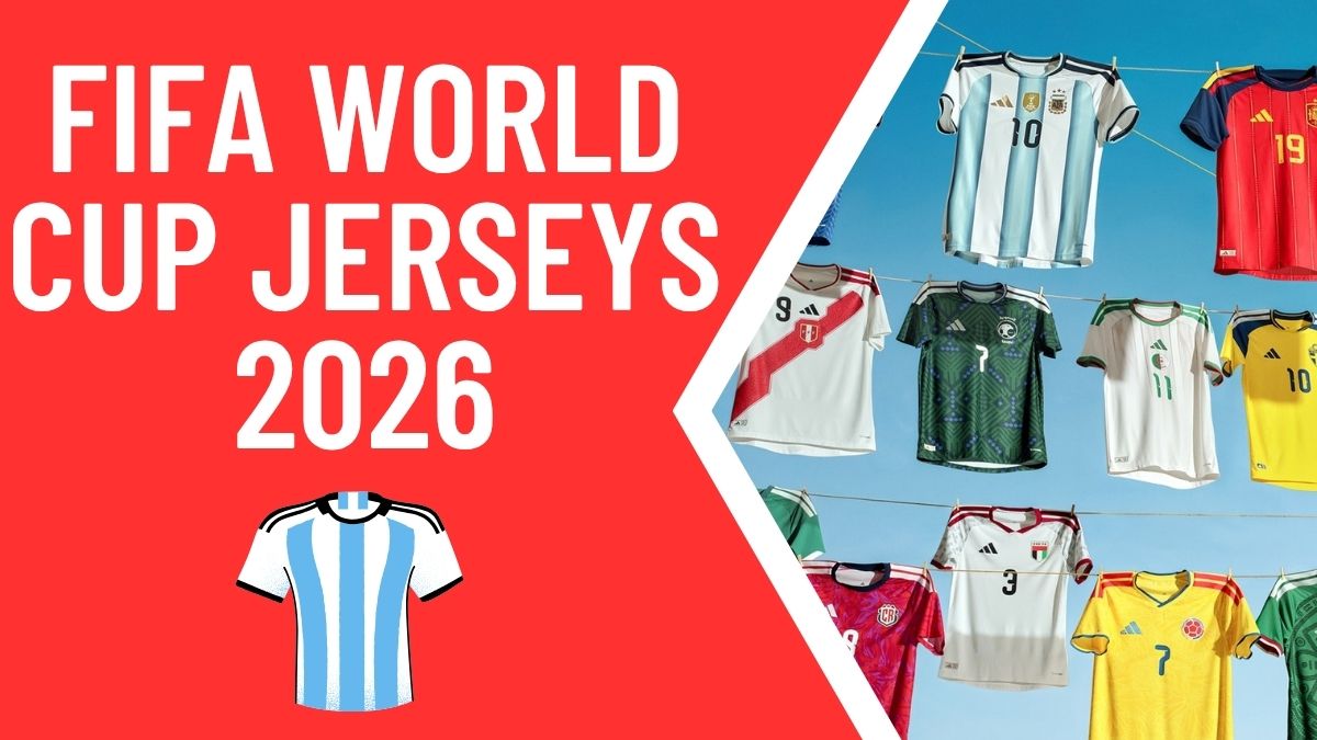
Fifa World Cup Jerseys 2026, Adidas has released their largest ever collection of home shirts ahead of the 2026 World Cup, dropping 22 kits all at once. Every single one is bespoke and different from the last, which makes this one of the most exciting kit releases in recent memory. Here is a full ranking of every shirt.
Common Design Themes Across the Collection
Before getting into individual kits, there are a few design elements shared across the entire collection worth noting. First, the thick Adidas stripes on the shoulders are notably fatter and chunkier than usual, which takes some getting used to but ultimately works in most cases. Second, every kit features a small motif on the back of the neck, a detail that has become something of an Adidas signature. Third, and perhaps the most striking touch, the Adidas badge contains a smaller Adidas badge within it. It is a subtle but genuinely cool extra detail across the whole range.
GOAT Tier
Germany
This is Germany’s last ever Adidas shirt before they move to Nike, and Adidas have made them pay for that decision by producing one of the best Germany kits in years. The inspiration comes from the iconic 1990 World Cup shirt, with a geometric pattern across the front that echoes that classic design. There is also a retro Adidas tag at the bottom as a nod to the brand’s older logos. This shirt is an instant classic and comfortably earns the top tier.
Japan
Adidas and Japan have always been a reliable combination, and this shirt continues that tradition. The design takes an abstract approach to the horizon, with elegantly curving lines mirroring each other out from a centralized badge, evoking the reflection of the sky on the sea. It manages to feel nostalgic and modern at the same time, sitting somewhere between 2000s minimalism and contemporary sleekness. Japanese elegance at its finest.
Read More: Can You Get a US Tourist Visa in Time for the 2026 FIFA World Cup?
Mexico
Mexico have leaned fully into their Aztec and Mayan design heritage here, building on the approach that made the 1998 shirt so beloved. The pattern covers the front of the shirt symmetrically, frames the number well, and includes small flashes of red that add dynamism without overwhelming the design. When a home shirt is this vibrant, this confident, and this well executed, it belongs at the very top.
Class Tier
Belgium
Belgium continue their fire theme, and it works beautifully here. The curving flame pattern in the base is subtle and elegant, and the cuffs are a particular highlight, drawing strong comparisons to the beloved Belgium shirt from 2000. A really well put together kit.
Chile
Chile’s kit is inspired by the feathers of the condor, the national bird, with an all-over pattern that is nicely subtle in the base. What elevates it above several others is the overlapping collar, which adds a genuine touch of class that many of the other shirts in this collection are missing.
Costa Rica
This one is vibrant in the best possible way for a home shirt. The all-over print uses leaves, toucans, and other natural elements in a red, blue, and pink tie-dye style pattern. Bold, colourful, and genuinely exciting as a home kit. Another class shirt.
Read More: FIFA World Cup 2026: Why US Hotels Are Facing an Unexpected Booking Crisis
Saudi Arabia
This is a genuinely interesting design that works on two levels. The base features geometric lines, squares, and dots inspired by the ornate decorative doors found across the country, while small flashes of purple reference the region’s lavender fields. Combining two distinct inspirations into one cohesive design is not easy, but this pulls it off. A small improvement to the badge colour could push it even higher.
Wales
Wales have brought back a central stripe design that has not been seen since 1984, and it stands out immediately. Modern touches including a flash of green and the Welsh word for Wales written across the front have been added to update it without losing the retro character. Centralized badge, nice cuffs, and a genuine sense of history behind the design.
Touching Class Tier
Argentina
The gradient stripes caused some initial hesitation, but the meaning behind them makes a real difference. The three tones of blue represent the shades worn in Argentina’s three World Cup winning shirts from 1978, 1986, and 2022. That context elevates something that might otherwise look a bit unusual into something genuinely meaningful.
Spain
A clean red base with blue shoulders and a pinstripe finish brings back more blue than modern Spain kits typically feature, which is a welcome change. The Adidas stripes use different colours on each side, a detail that sets this kit apart from others in the collection. The only minor criticism is that it edges slightly toward a baseball shirt aesthetic, but it is easy to look past that.
Venezuela
The triangular topographical pattern inspired by the country’s mountain ranges is cool and distinctive, and the flag colours on the sleeves add the extra dynamism needed to push this just above solid into touching class territory.
Read More: FIFA World Cup 2026: The Ticket Price Crisis and What It Means for the Beautiful Game
Solid Tier
Algeria
Inspired by the sand dunes of Algeria, with three stripes fading outward in sandy tones and triangular patterns forming the dunes. A meaningful and decent looking design that sits comfortably in solid.
Colombia
The all-over pattern draws from the Latin American artistic movement of magical realism, blending fantastic elements with realistic environments. It is a genuinely cool concept, and the execution is strong. The all-yellow base is the one element that holds it back from reaching class.
Qatar
A simple zigzag pattern in the base inspired by the Qatari flag. Nothing groundbreaking, but a safe and clean design that does the job well.
Scotland
A cross pattern inspired by the flag of Scotland, handled with enough subtlety to avoid being obvious. There is almost a tartanlike quality to it when viewed at an angle. A solid and respectable effort.
Sweden
Understated from a distance, but closer inspection reveals an embroidered floral pattern referencing the traditional folk dress styles of the 1970s. That extra layer of cultural detail is exactly the kind of thing that rewards closer attention.
Ukraine
A geometric interpretation of the Ukrainian coat of arms, turning its traditional lines and shapes into bold polygraphic symmetrical designs. It lands well and earns a solid placement without question.
Meh Tier
Hungary
A simple red shirt produced to mark the 125th anniversary of the Hungarian Football Federation. The restraint is understandable and even admirable in principle, but the end result just does not stand up against the ambition of the rest of this collection.
Italy
Italy and Adidas have had an up and down relationship, and this feels like a down moment. Gold and laurel motifs are meant to convey prestige and glory, but the execution is underwhelming. For a nation whose kits are usually beautiful, this falls well short. Puma’s recent Italy shirts were considerably more impressive.
United Arab Emirates
A geometric shoulder pattern referencing the shield shapes in the federation’s crest. The concept is fine, but the overall shirt feels dull. The grey tones do not land, and the pad looks slightly awkward.
Awful Tier
Northern Ireland
A darker and lighter green split design with dynamic lines inspired by the country’s architecture. The concept does not really come through in the finished product, and the overall effect is more confusing than striking. The weakest shirt in the collection.
Peru
Peru’s iconic red sash is one of the most recognisable design elements in international football, and this kit had a genuinely clever topographical mountain range concept to place inside it. The problem is that the execution of the sash itself does not work. The design inside it is good, but what has been done to the shape and feel of the sash undermines the whole thing.
Conclusion
Adidas have produced a remarkable collection with this World Cup 2026 drop. Twenty-two kits released simultaneously, all with bespoke designs rooted in national identity, and only two landing in the awful tier is a genuinely impressive hit rate. Germany’s farewell shirt and Japan’s elegant simplicity stand at the very top, while Mexico’s full commitment to their Aztec heritage makes for one of the most visually exciting home kits in years. It is a collection that rewards looking closely, and there is plenty here for fans of any nationality to admire.
Frequently Asked Questions (FAQ)
Q: How many kits did Adidas release in this World Cup 2026 drop?
A: Adidas released 22 home kits simultaneously in their largest ever single collection drop ahead of a World Cup.
Q: What design features are shared across all 22 kits?
A: All 22 kits feature thick chunky Adidas stripes on the shoulders, a small motif on the back of the neck, and an Adidas badge that contains a smaller Adidas badge within it.
Q: Which kit was rated the highest overall?
A: Germany, Japan, and Mexico were all placed in the top GOAT tier. Germany’s kit, inspired by their iconic 1990 World Cup shirt, is widely considered the standout of the entire collection.
Q: Is this Germany’s last Adidas kit?
A: Yes. Germany are moving to Nike, making this their final home shirt produced by Adidas.
Q: Which kits were rated the lowest?
A: Northern Ireland and Peru were placed in the awful tier, with Northern Ireland’s split green design and Peru’s mishandled sash execution both falling short of expectations.
Q: What is the meaning behind Argentina’s gradient stripes?
A: The three tones of blue in Argentina’s stripes represent the shades worn in their three World Cup winning shirts from 1978, 1986, and 2022.
Q: Why does Wales have a central stripe design?
A: Wales have revived a central stripe design that was last used in 1984, making it a genuinely retro and historically significant choice for this collection.

